Design your own art project:
Project Description: For this project, we were able to choose something we were interested in and researched that subject. I chose to improve my photoshop skills. While I was researching, I learned different techniques on a newer version and an older version of photoshop and their different techniques. I would ask for help but I learned how to be independent.
|
Pre Assessment:
|
Final Piece:
|
Logo Project:
|
For my final logo, I decided to combine two things I love cursive and the design it has inbetween as my basis. I did my initials because I think in cursive it looks very professional and it pops out. When I was in third grade I was learning how to write in cursive but over the past few years, we stopped and it’s not required anymore. In my opinion it is a skill that improves handwriting and legibility and makes your writing more professional. I have always wanted to write perfectly in cursive and I thought this could potentially be the start of trying to gain those skills again. As well as playing with the pen and anchor tool to smoothen my initials. This gave my logo a nice texture and a nice representation that looked more refined. I especially love the color scheme in my logo and how they are both balanced.
In this project I learned how to use the scanners and how to live trace as well as using the pen tool and trouble shooting when one wouldn’t work. I learned this by using a new program called Adobe Illustrator, one I have not been particularly fond of due to it’s challenging levels. You first crop your scanned sketch and opening it in illustrator. You either select a live trace and look at the different options or use the pen tool. As well as using different colors and texts to personalize your logo. Furthermore, you place your logo on a proof sheet on objects.(Water bottles- shirts) I will definitely take away from this project was learning how to use a new program that allows you to create a simplistic design to portray so many different things. Overall, this project was challenging I had to go through many objectives and multiple logo designs. Starting to place my sketch into illustrator as well as going through the variety of options for live trace. Trouble shooting and using the pen tool if the format wouldn’t look refined with my logo as well as using the different strokes. I wanted to stick to just my initials in cursive and not have anything behind, later on I decided that it gave it a different aspect when I added the back peice of my logo. I had done many sketches and either were not appearing or just didn’t suit well. I was finally able to find the one logo I liked with the stroke I wanted and I was finally done. |
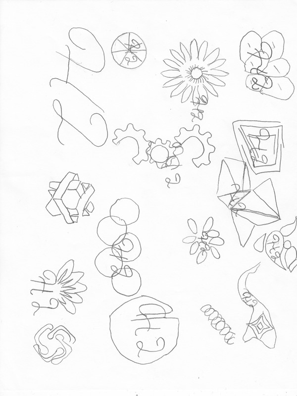
First Stage Sketches :
Final Logo:Layout Sheet: |
Tutorials Project:
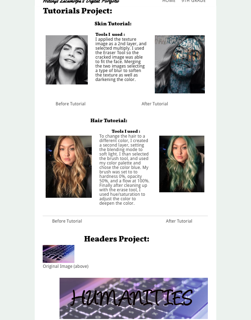
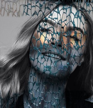
Skin Tutorial:

|
Tools I used :I applied the texture image as a 2nd layer, and selected multiply. I used the Eraser Tool so the cracked image was able to fit the face. Merging the two images selecting a type of blur to soften the texture as well as darkening the color.
|
|
|
Before Tutorial
|
After Tutorial
|
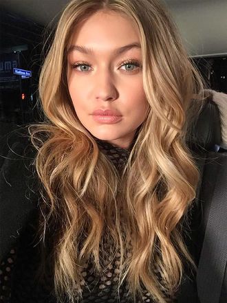
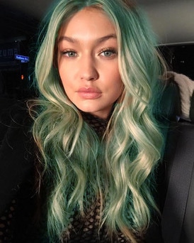
Hair Tutorial:
Tools I used :
|
To change the hair to a different color, I created a second layer, setting the blending mode to soft light. I than selected the brush tool, and used my color palette and chose the color blue. My brush was set to to hardness 0%, opacity 50%, and a flow at 100%. Finally after cleaning up with the erase tool, I used hue/saturation to adjust the color to deepen the color.
|
|
|
Before Tutorial
|
After Tutorial
|
Headers Project:

Original Image (above)
Original Header I created before the critique. (above)
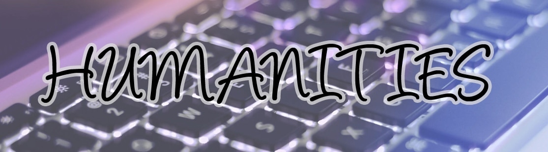
Final Header I created after the critique. The first draft of my humanities header was a little hard to read so I went back and added a few more things to make the title stick out from the background image. (above)
